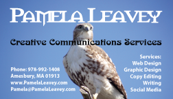
 I have been dabbling with a new business card off and on for a couple of weeks and finally settled on the one to the left. I had contemplated a two-sided business card with the services printed on the back, but ultimately, I decided to keep it simple, with everything on the front.
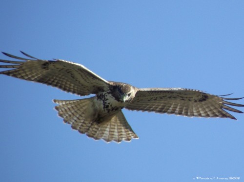
I did not want to do plain business card with just text on it; I wanted something that would stand out and make an impression. After trying a few different photos from my collection of birds, boats and landscapes, I decided on this photo of an Immature Red Tail Hawk. The hawk is symbolic to me as totem of vision and intuition and it also represents my fine eye to detail. In graphic design work, I always strive to be certain that the littlest of details is just right.
The business card above was created in Adobe Illustrator. I used three fonts: Morpheus which has a bit of a Celtic feel, Nouveau for the artistic flair and the popular Humanist typeface Myriad Pro.
The goal in creating my new business card was to reflect my creative abilities through symbols of my personality in order to promote my freelance services noted on the business card.
Working with a client on a project like this, would require getting a feel for the client’s image and personality as well as the message they want to project.
Related Images:
