Pamela Leavey

words and pictures....

Browsing:

Category: Graphic Design

On Writing: Why Prewriting Matters

deskIn the past, my writing style typically leaves out the all important first stage of writing—pre-writing.  When I write, I tend to write and then rewrite but rarely ever do I engage in pre-writing.

Needless to say, when I started taking creative writing classes at UMass Amherst UWW, I learned that I was cutting out an integral part of the writing process. Jumping right into the writing phase works if you know what you are going to write about, but when you’re stuck pre-writing frees up space and opens up the creative channels.

Reading Chapter 1 of Connie Griffin’s text, To Tell The Truth in my Magazine Writing class gave me a keener understanding of how to use pre-writing as a strategy to break free from writer’s block. The creative process needs the freedom to be expressive, and pre-writing can be seen as a fun exercise in letting go, while also trusting one’s subconscious in a “nonjudgmental and forgiving” way. (p. 5)

The Getting Started (p. 6 – 7) section in Chapter 1, helped me to understand that pre-writing is comparable to a dancer warming up with exercise and practice, or a painter sketching in a rough outline on his canvas in preparation for creating his painting using the tools of his craft. When seen in that light, I suddenly found how pre-writing should and could fit into my process. (more…)
Related Images:


My Latest Web Design Project

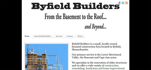
My latest web design project is a WordPress business website for Byfield Builders, a small, locally owned, licensed construction firm located in Byfield, Massachusetts.

byfield builders ByfieldBuilders.com was created using WordPress, a robust and highly functional platform that can be easily optimized and customized for use as either a blog or a fully functional small business website, with our without a blog. (more…)

Related Images:


Happy Halloween

halloween

Halloween is now considered to be a secular holiday, but its history is based on the ancient Celtic festival of Samhain: (more…)

Related Images:


Creating a Business Card to Reflect Your Image

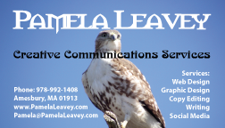
pl-biz-cardI have been dabbling with a new business card off and on for a couple of weeks and finally settled on the one to the left. I had contemplated a two-sided business card with the services printed on the back, but ultimately, I decided to keep it simple, with everything on the front.

I did not want to do plain business card with just text on it; I wanted something that would stand out and make an impression. After trying a few different photos from my collection of birds, boats and landscapes, I decided on this photo of an Immature Red Tail Hawk. The hawk is symbolic to me as totem of vision and intuition and it also represents my fine eye to detail. In graphic design work, I always strive to be certain that the littlest of details is just right.

The business card above was created in Adobe Illustrator. I used three fonts: Morpheus which has a bit of a Celtic feel, Nouveau for the artistic flair and the popular Humanist typeface Myriad Pro.

The goal in creating my new business card was to reflect my creative abilities through symbols of my personality in order to promote my freelance services noted on the business card.

Working with a client on a project like this, would require getting a feel for the client’s image and personality as well as the message they want to project.

Related Images: